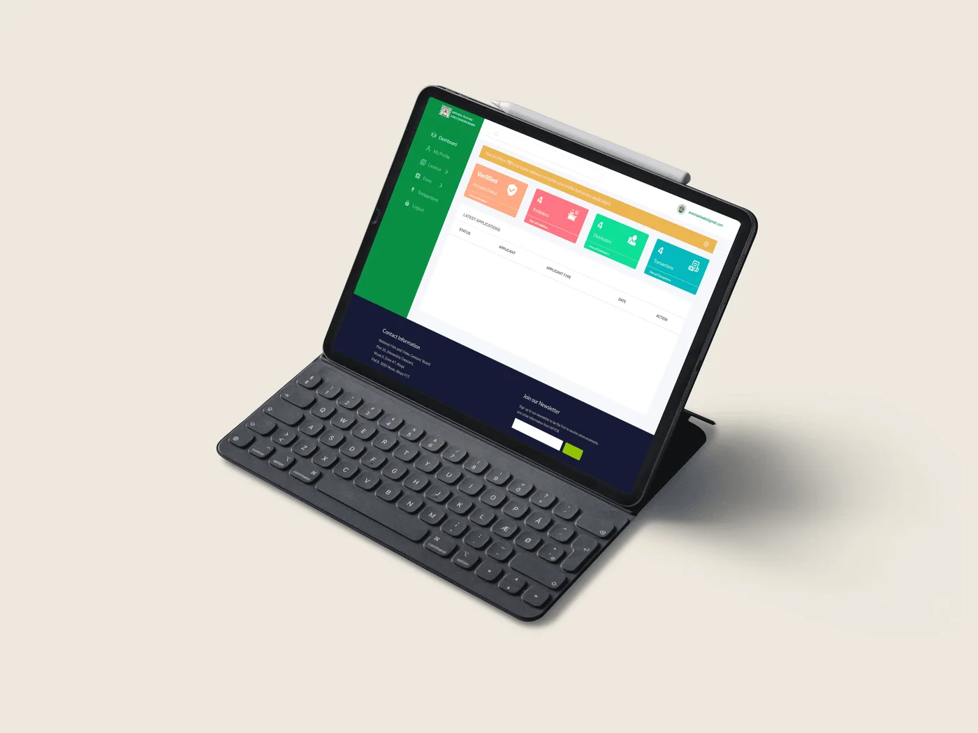
They asked for an online form. The process was bigger than the form.
If you have ever stood in a government office holding photocopies, been told to come back next week, and then been told on your return that something was wrong with page three, you already understand the problem we were handed. That queue is where Nigerian filmmakers lost weeks they could have spent making films.
The National Film and Video Censors Board’s request was simple and reasonable: stop making people print things. Put the licensing and film-classification forms online so producers, distributors and exhibitors can submit from anywhere.
Then I read the existing requirements. A completed form with the CEO’s passport photograph. A certificate of incorporation showing at least ₦3 million in share capital. Certified true copies of the memorandum and articles. Profiles of the company, its directors and its mandatory officers. Proof of presence in all six geopolitical zones. A bank reference letter. Photocopied tellers for a ₦12,000 processing fee and a ₦200,000 licensing fee.
Nobody assembles that in one sitting. Putting it on a web page would not have made it lighter — it would have made it faster to fail. That was the moment I stopped treating this as a digitisation job.
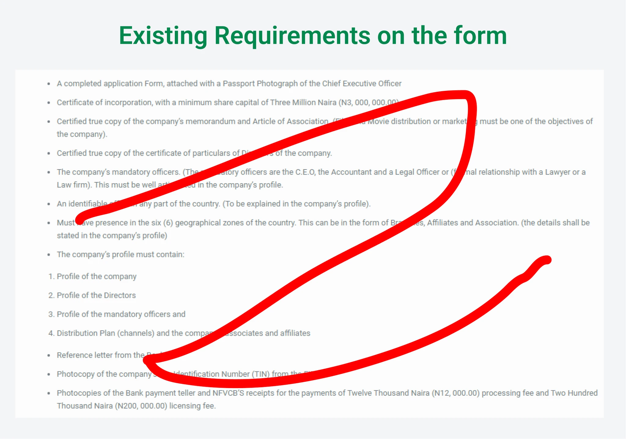
What the client asked for: put the paper forms online. What the research would show: the form was the smallest part of the problem.
We asked the people on both sides of the counter first.
Before drawing a single screen, we interviewed filmmakers, industry stakeholders and the NFVCB staff who actually process applications, and backed it with surveys and a look at how other government portals handled the same job.
What came back reframed the project. A submission was not a transaction that ended in a licence — it was the opening move in a review that travelled through departmental assignment, staff scrutiny, correction and a director’s final signature. And people came back: some licences renewed annually, others every two or three years, some submissions far more often than that.
The most useful thing we learned was that there was no single user. There were four, and each was suffering differently.
- 01
Producers, distributors, exhibitors
Re-uploading identical company documents for every request, waiting weeks with no visibility, and navigating a form complex enough that errors were close to guaranteed.
- 02
Distribution, exhibition, censorship, accounts
Reading applications across a variety of handwritings, unable to reach clients to fix errors, and losing time to downtime on external verification services.
- 03
Final approval
Signing off on paperwork they could not easily audit, often without confidence that staff had properly verified what was in front of them.
- 04
Site managers, accountants, librarians
Reconciling payment receipts against bank statements across two parallel spreadsheets, and receiving submitted films by flash drive — an operational headache and a security exposure at once.
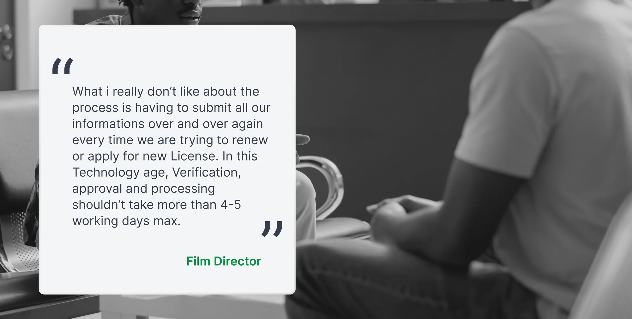
The insight that set the direction: an application is a relationship with the agency, not a document. Design the relationship.
We designed for complete information. Then we watched people try to sign up.
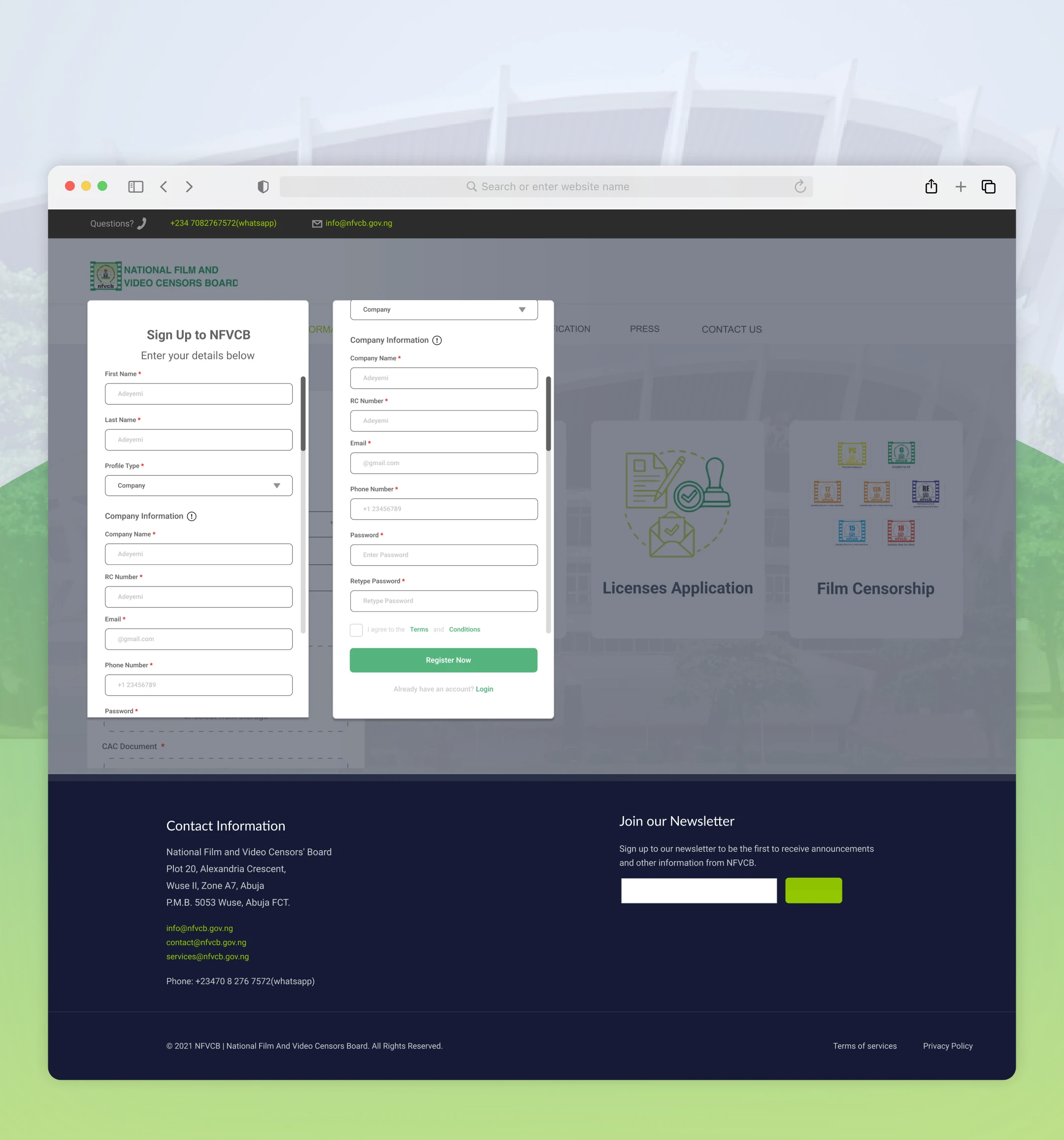
We turned the requirements and the approval journey into a product. Registration ran across three steps and collected everything: personal details, full company information, then the supporting documents. We wired in CAC and NIBSS so an RC number, BVN or passport could verify a company automatically instead of a staff member doing it by eye.
The logic felt sound. Capture it once, reuse it forever. I still think the instinct was right — I just put it in the wrong place.
Then we tested, and users walked straight into the wall we had built. Sign-up alone blew past the time budget we had set for it. And the questions were not about layout or labels. They were about life: What if I don’t have all my documents ready? Can I save my progress? What if I’m not ready to apply today?
That is the part worth sitting with. We had designed the whole system correctly and then stacked all of its weight on the very first step. Creating an account felt like completing an application. People were being asked to be ready before they were allowed to begin.
The archived write-ups describe this feedback but record no participant count and no measured completion rate afterwards. These are qualitative findings and I am not going to dress them up as anything more.
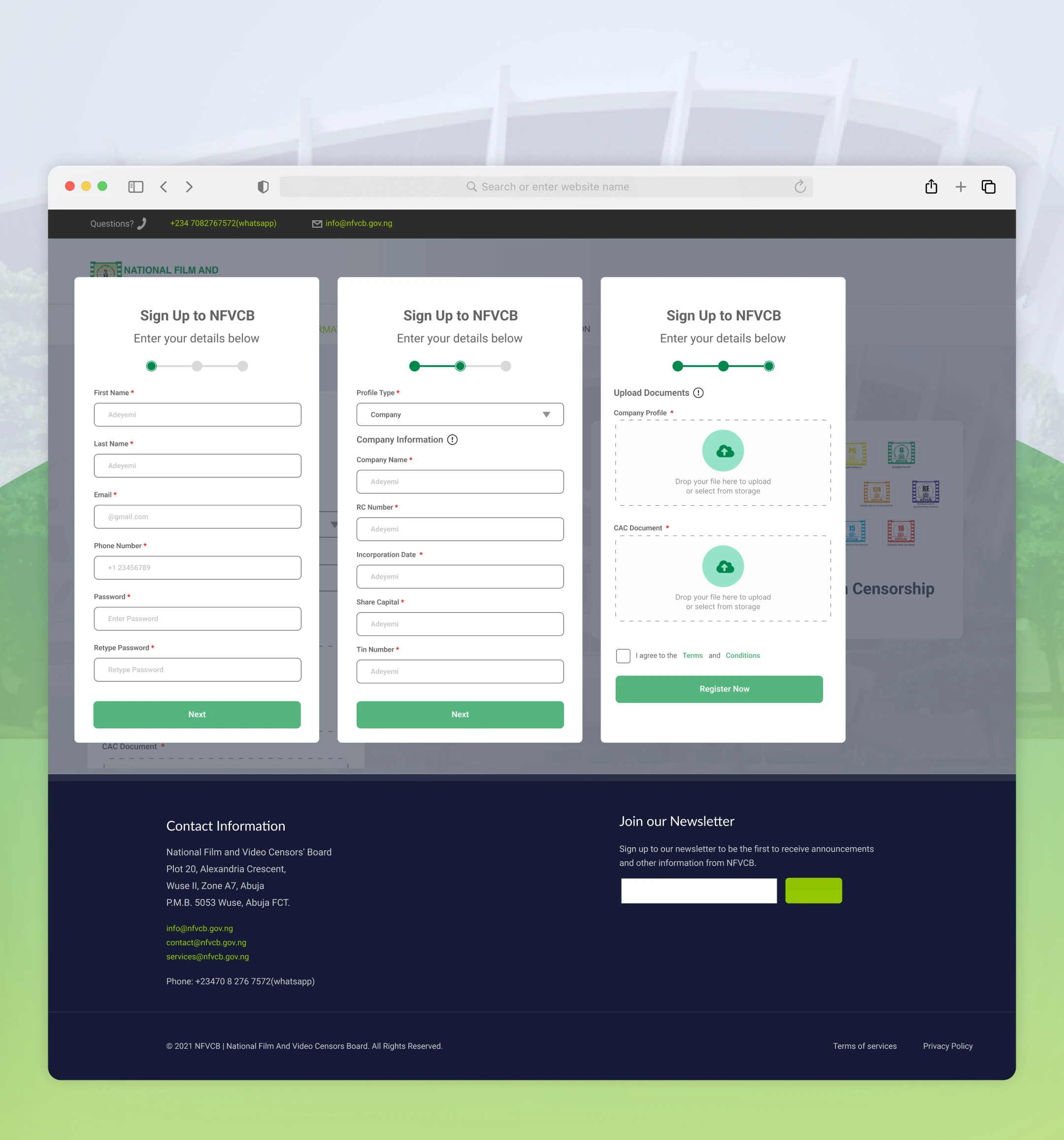
Our assumption: collecting everything early makes review easier. What we missed: it makes starting impossible.
We considered autosave. We moved the weight instead.
The obvious fix was autosave. Let people pause and come back. We discussed it seriously — and then rejected it, because it solved the symptom and left the disease. You would still be staring at a long form before you had an account, just with permission to stare at it in instalments.
So we cut registration back to what someone needs to get through the door, and moved company details and document uploads into the signed-in experience, next to the application they actually serve. A dashboard banner tracked profile completion, so the requirement never disappeared — it just stopped being a gate.
This is the decision I would still defend in a room today. It was not about making a page shorter. It was about separating two things the original design had fused together: having an account, and being ready to apply. Once they came apart, the portal became useful to someone who was still gathering their paperwork — which, it turns out, is almost everyone at the start.
Autosave was discussed but I am not claiming a shipped draft feature. The documented change was moving requirements out of initial sign-up.
- 01
Keep the long form, add autosave
Lets people pause and resume, but still makes registration depend on preparing a pile of material up front. Treats the symptom.
- 02
Make sign-up lighter
Defer profile and document requirements to the logged-in experience, closer to the application itself. Treats the sequence.
What started as a digital form became a service.
Before: printed forms carried to an office, the same company documents submitted again and again, and no way to know where anything stood. After, as reported: online submission, accounts people return to, lighter onboarding, reusable documents, visible stages and a multi-role review behind them.
Both archived accounts report processing time falling from around two weeks to roughly two to three hours, and over ₦100 million in online application fees in the first year. They disagree on the percentage improvements, so I have left those out rather than pick the flattering one. These were programme-level outcomes — staff, engineering and design together — not a number I get to claim alone.
Two decisions mattered. Question the brief before drawing screens: the research is what revealed the approval layers and the renewal cycles, and without it we would have shipped a very tidy form into a process that still did not work. And when the first registration test failed, fix the sequence rather than the page — the temptation to add autosave and move on was real.
One problem from this project outlasted it. Working on the portal in 2021, I kept seeing the same gap behind the paperwork: Nigerian screen work was being produced far faster than it was being recorded, and no one owned the record. We sketched a trailer and artist channel into the closing roadmap — somewhere films, casts and companies could be found rather than filed. NFVCB didn’t build it. Five years later I did, as MuviDB.
What I would measure next, given the chance: sign-up completion, time to finish an application, incomplete submissions, repeat document uploads, processing time and return-for-correction rates. Suggested future metrics, not historical results.
My contribution was translating the research into a recurring, multi-role service, and then revising onboarding when testing exposed how heavy we had made the entrance.